Biocode — 2024

We have to reverse global heating
We have to reverse global heating
- Product design
- App development
- Web development
Biocode is the carbon footprint calculator for food brands and producers. It’s an easy tool for calculating emissions and clearly communicating environmental values to end customers.
I worked for Biocode as a Senior Product Designer and Front-end Developer. I was crafting our brand and website, maintaining our design system, developing our application and enhancing the overall direction of our product.
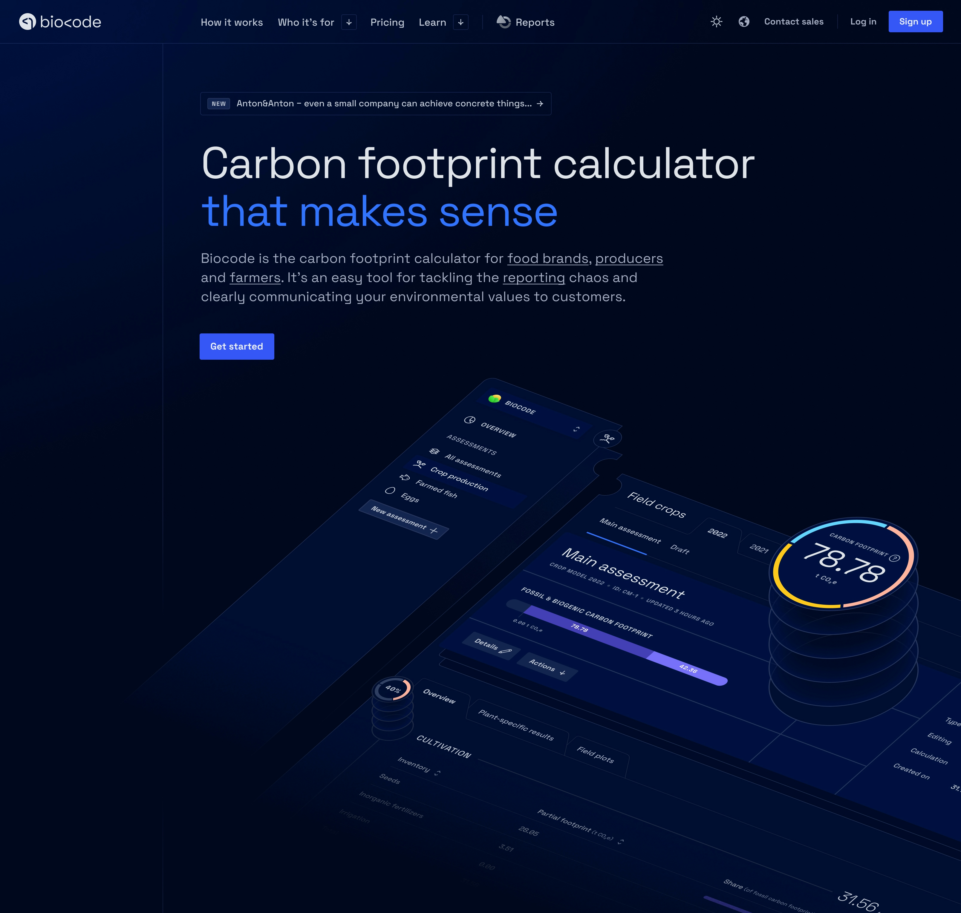
Understanding the positioning of Biocode
The brand renewal began with a clear objective: to reposition Biocode, initially perceived as a consulting service, into a scalable SaaS product, aligning with our mission to provide food businesses with an efficient carbon footprint calculator
Problems
During the positioning project, we discovered that Biocode's brand and old website were not effectively communicating its USPs and the real value it provides to users. This misalignment created confusion among potential customers, leading to lower engagement and a lack of clarity.
Challenges
We needed to shift Biocode's positioning from a service-oriented brand to a product-centric SaaS model and make sure that the website communicated the value Biocode offers to its users. The main challenge was translating this into a brand design that highlighted Biocode's key advantages and set it apart from competitors.
Solutions
We addressed these challenges by showcasing Biocode’s strengths, like ease of use and credibility. The new design highlights the problems Biocode solves, with clear messaging and interface that guides potential customers through the product's benefits.
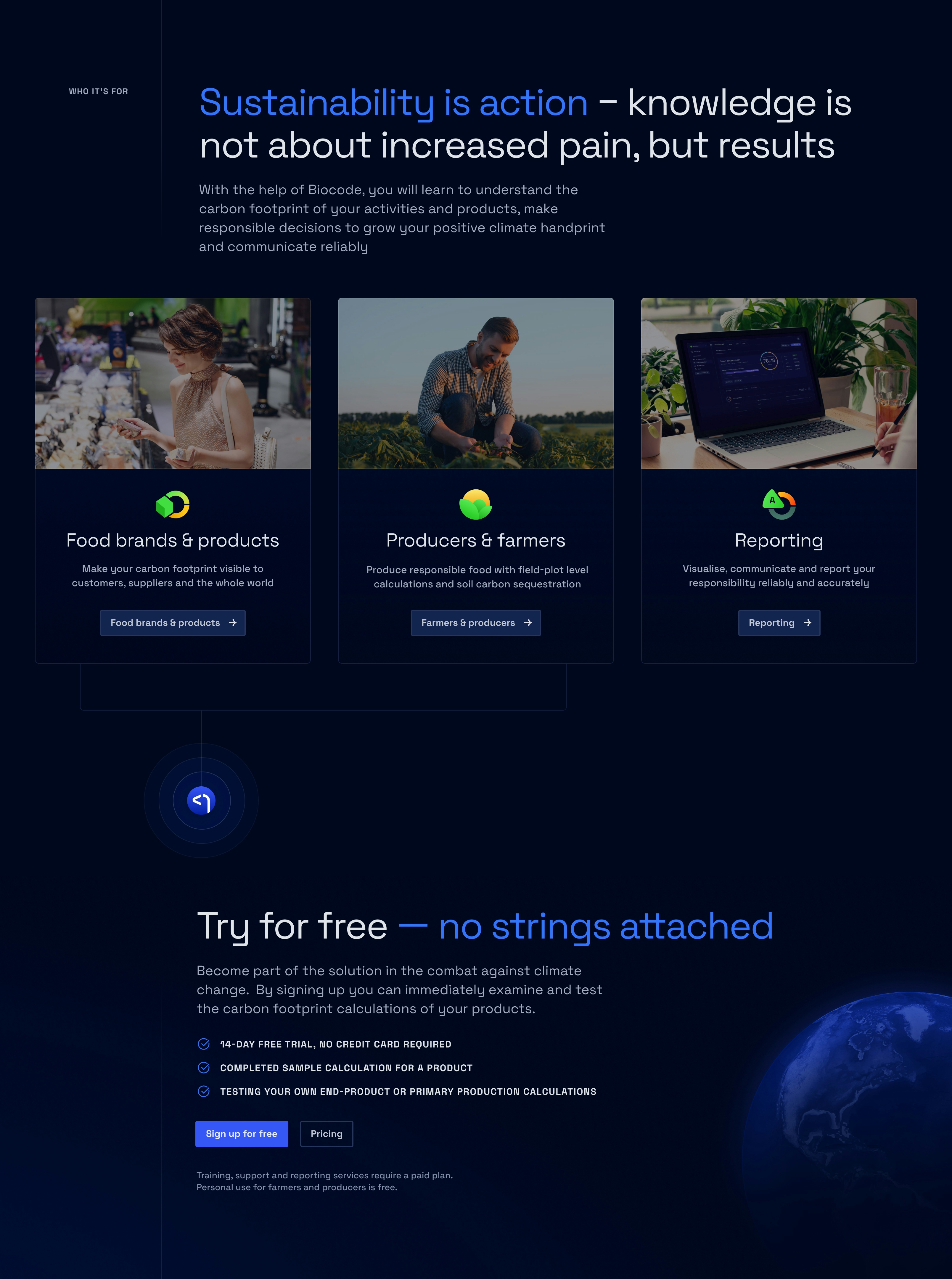
Essential features we needed
- Key app features showcasing main USPs
- Strategically placed CTAs for user sign-up
- Feedback quotes from satisfied clients
- Logical navigation and content structure
- Emphasis on application trustworthiness
- Targeted sections addressing user needs
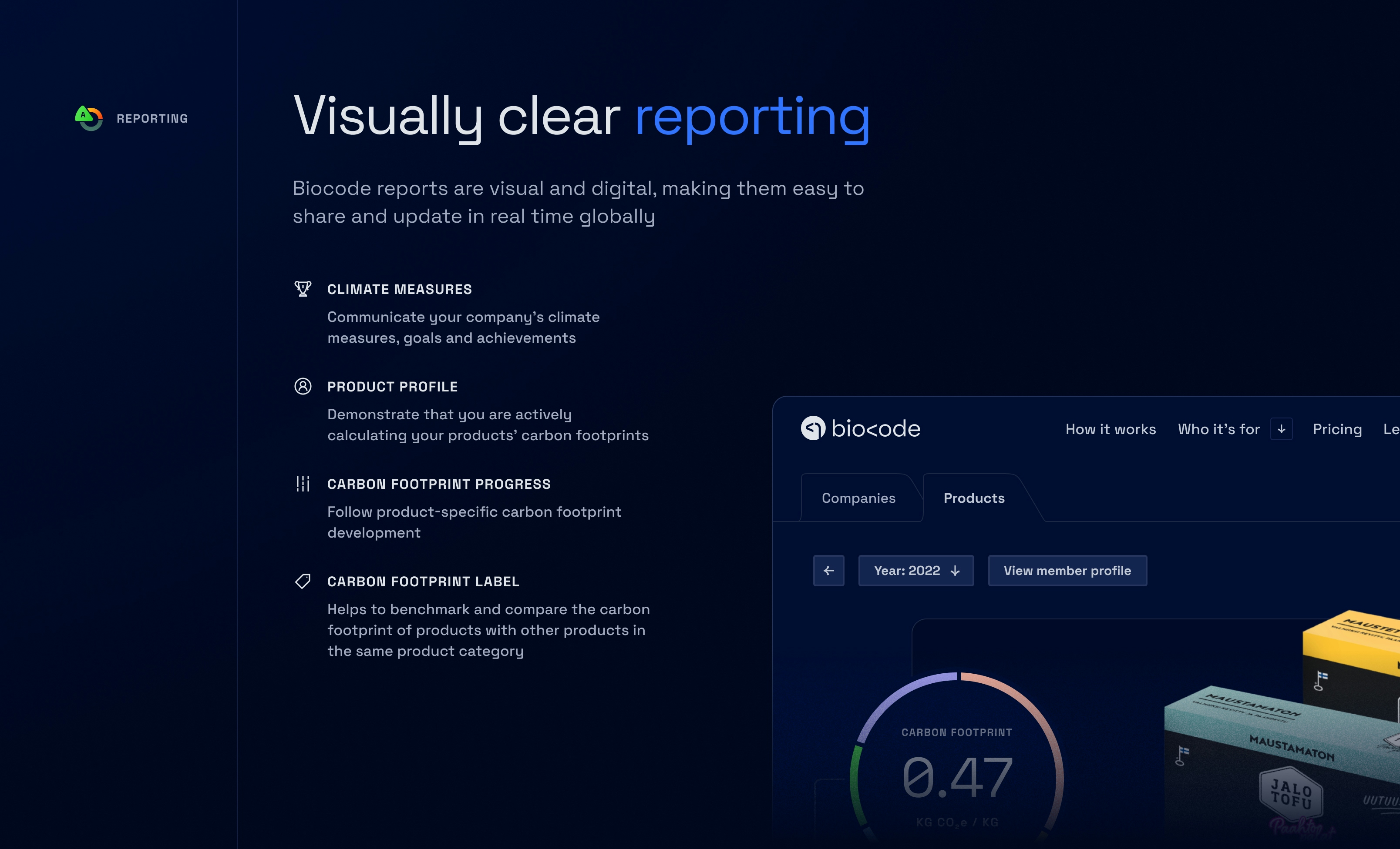
Engaging our users
We built Biocode's reporting service to empower users to share emissions data, attract eco-conscious consumers, and strategically promote Biocode. This commitment to environmental responsibility differentiates Biocode, driving more businesses to adopt our platform.
Shifting the focus to a product-centric design
The transformation required a major UX and aesthetic revamp to reflect modern SaaS efficiency. Guided by the positioning, the redesign focused on presenting Biocode as a clear and compelling software solution.
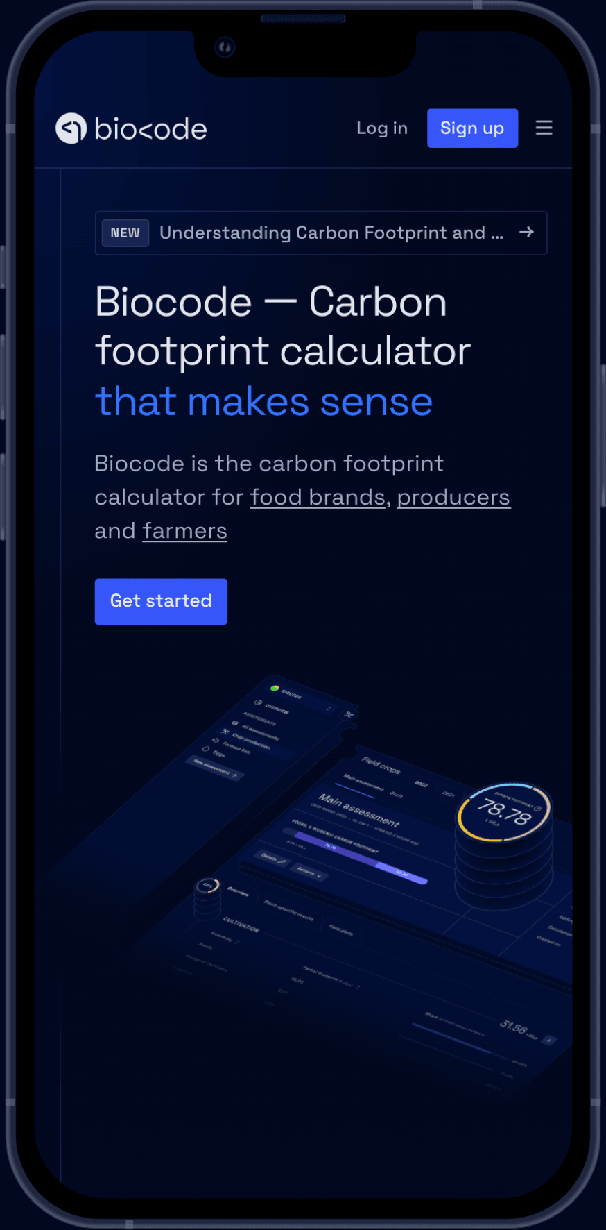
Strong first impression
The homepage was strategically redesigned to make a powerful first impression. We wanted to communicate that anyone can easily calculate emissions, regardless of expertise, making the tool accessible to everyone.
International and distinctive
The website was initially designed in dark mode for a modern look, then adapted to light mode for broader accessibility. We aimed for global professional application-like
feel and limited food imagery to keep the brand versatile, reflecting the application's broad emission calculation capabilities.
Unified visual identity
Biocode was missing a logomark and an icon, which is a crucial piece of any fully-fledged product. We created a new logomark which was also integrated as part of the wordmark for better recognition.


Emphasizing core strengths
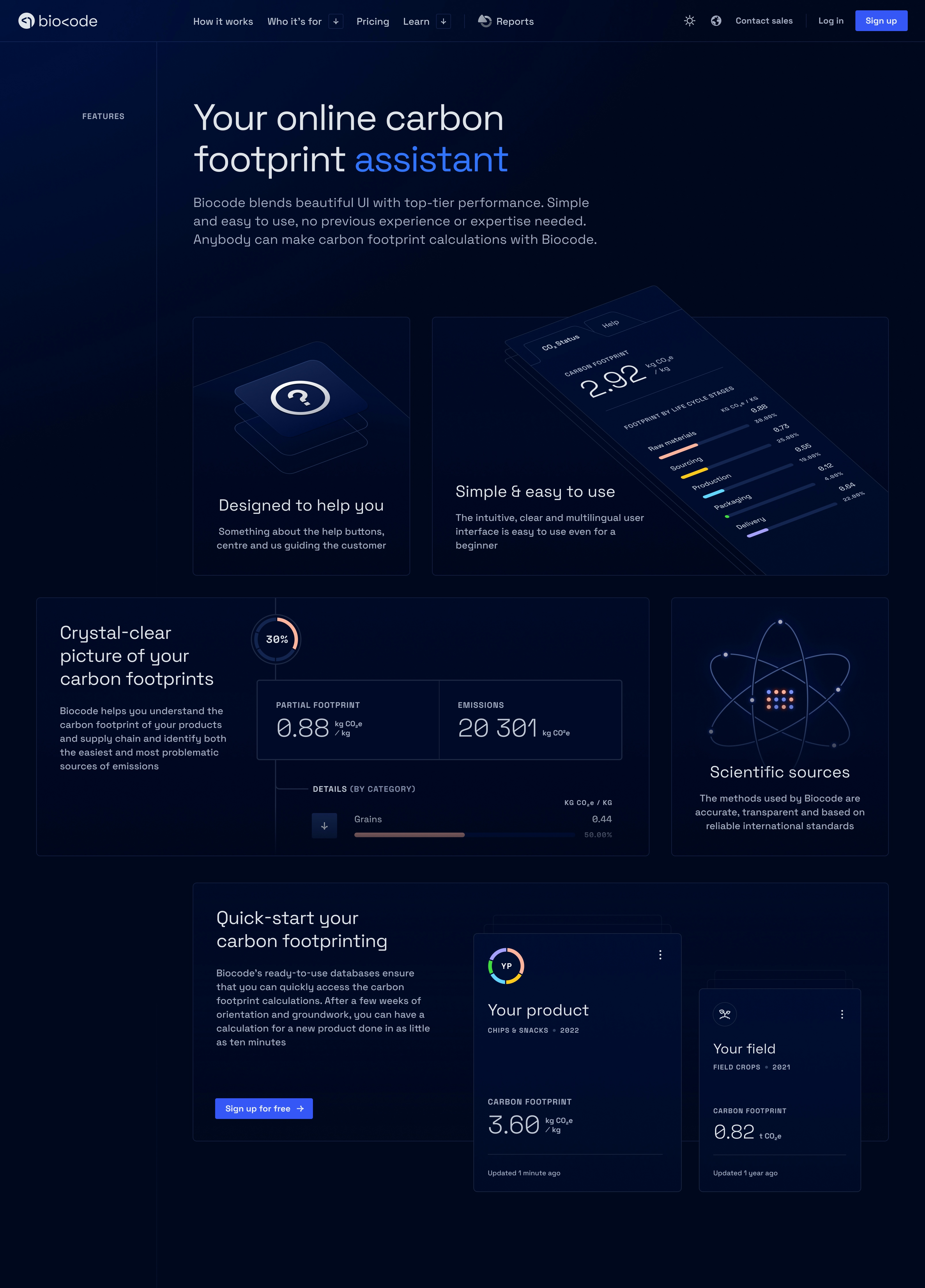
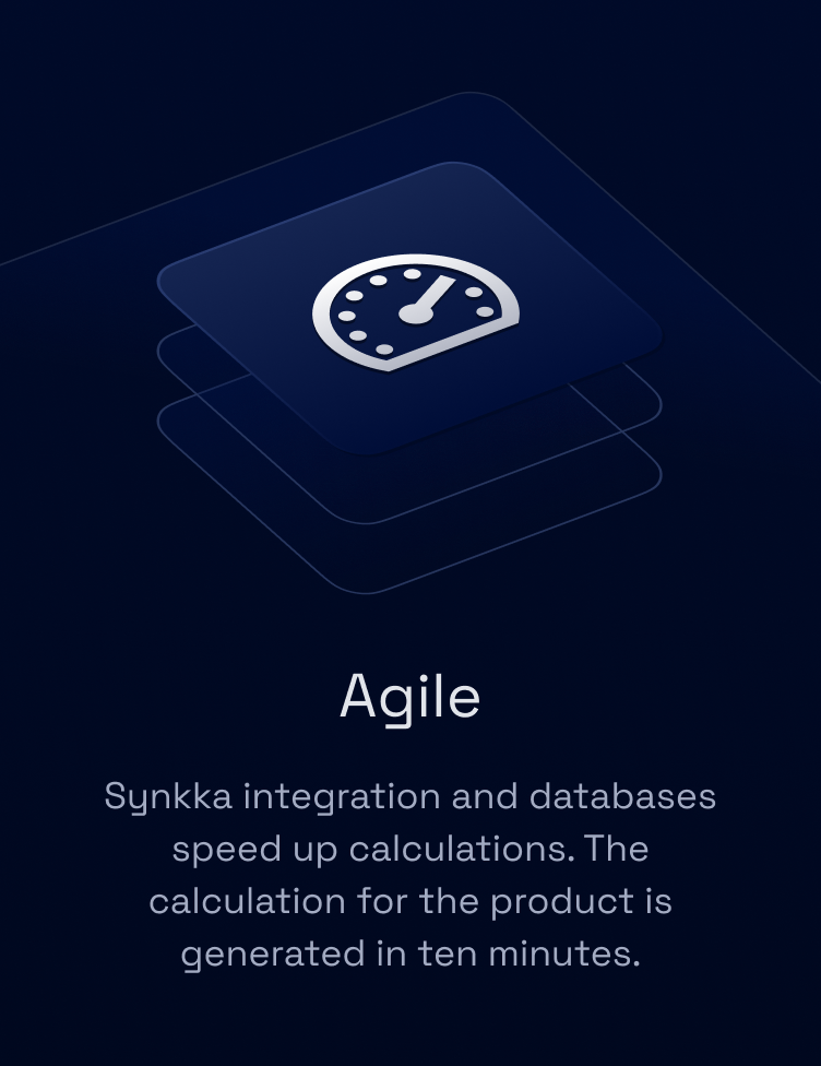
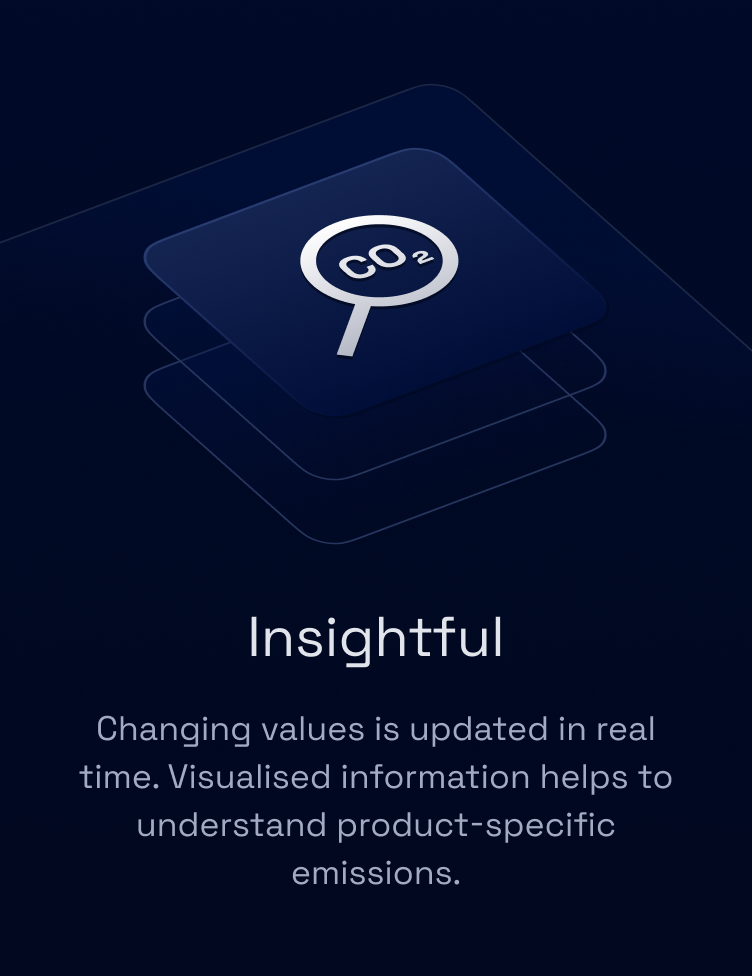
We really wanted to highlight the core advantages by designing sections that showcase them using visually appealing bento grids
and other flashy elements.



In-depth features
Among emphasizing the core USPs we also planned detailed sections of individual features of the application to gain a deeper insight into the specific tools and capabilities.

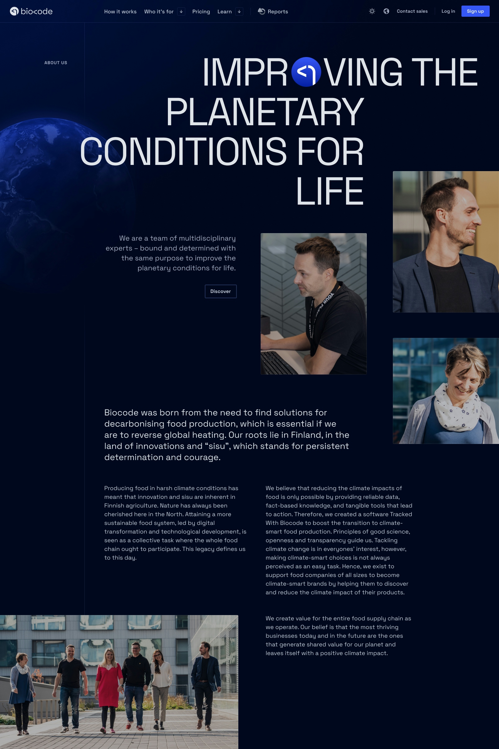
Transparent and trustworthy expertise
We aimed to showcase the transparency, expertise, and dedication of our team. Our staff is committed to delivering accurate carbon calculations and clear, reliable results. Additionally we arranged a photoshoot to create unique visuals that are also used in our various marketing materials.
”It wasn't easy to trust a carbon footprinting service provider, but Biocode has solid connections with universities and research institutes, which convinced us. Biocode is more unubiased.
Biocode Design System
The foundation of our design, hosted on GitHub and designed with Figma, serves as a comprehensive library used across our entire ecosystem, providing a consistent look and standardized approach in maintaining coherence throughout our products


Flexible components
Both our Figma and code libraries are highly flexible, allowing us to create a wide variety of component combinations. Our data display components, such as charts, and data tables, are designed to effectively present emissions results in an easy-to-understand format.


”Biocode has dramatically increased our understanding of our products and their emissions. For example, our own knowledge of the carbon footprint of our oatmeal is now crystal clear.


Distinguishing key areas with symbols
To help users easily identify the distinct sections of Biocode, our design system includes specific symbols for each area: for producers, for food businesses, and the reporting service, along with essential iconography.

Reflecting brand identity with typography and color tokens
Complementary colors, green and yellow, were selected to reflect the connection to nature, reinforcing the environmental focus of our brand. To make our data displays both clear and accessible, we chose accent colors specifically for this purpose.


The primary color, a clear blue, symbolizes the sky and our commitment to preserving the climate in its natural state. Our main typeface, Space Grotesk, features a custom stylistic set that balances credibility with subtle sense of creativity.
The brand's dark/light theme and selected imagery, such as the globe, subtly reference the global challenge of climate change. Each component, from typography to color choice, was designed to convey a sense of reliability while maintaining slightly playful and modern aesthetic.
Note that this case study showcases mainly dark themed elements for simplicity. Biocode's design system consists tokens for light theme as well, see below.
Simplifying the carbon footprint calculating
Biocode is designed to make calculations straightforward and accessible. While the process may seem complex, our platform simplifies each step, allowing users to easily track and reduce their environmental impact with confidence and clarity.

Real-time results Fast and comprehensive emission breakdown in seconds
GHG Protocol Scope 1–3 emissions including location/market-based emissions
Emission factor database Large ready-to-use emission database at your fingertips
Essentials Emission sharing, suggestions, tips, scenarios, comparison, customization…
Continuous UX research to match user needs
Our UX processes begin with planning user interviews, in collaboration with the marketing team, to better understand user needs and improve both the UX and UI of the application. As one part of this effort, we are currently designing new UI and unifying the interfaces of the producer and product sections, with a focus on consistency across the platform.
Note that some of the features presented in this case study are still work in progress.

The UI unification process involves converting design elements like spacing, colors, and components to match our cohesive design system. Our UI is constantly evolving, and we continuously refine our approach, selecting the best components and solutions for each use case to optimize clarity and accessibility, for example:
- Notice the subtle differences in spacings; currently spacings are too big (2.) and we need to reduce them to give more space to essential elements such as inputs
- Better positioning and visibility for the main action button (1.)
- Clear wording:
New calculation
is more understandable thanNew assessment
(1.)
”Trying to calculate my carbon footprint felt like attempting advanced calculus with an abacus. Thank goodness for Biocode, swooping in like a digital superhero to save the day with their user-friendly interface and renewable brainpower!
”Before we bought Biocode, I thought that carbon footprinting calculation would be really confusing, we couldn't do it, and we wouldn't know how to do it. But luckily you don't have to be a carbon footprinting expert to use Biocode.
”The calculator is incredibly illustrative. When I enter or change values, I can see the effect on the result immediately and concretely.


Designing emissions calculation for clarity and instant insights
Our goal is to make the user comfortable with clear navigation and data structure. With real-time updates to emission values and detailed breakdowns for each LCA stage, users can feel encouraged by the progress they’ve made, even after entering just a single input. Main actions, and other elements are placed for easy discovery, while onboarding includes example calculations and instructions to help users getting started with the application.

We wanted to make sure that users can easily move between views, always knowing where they are in the process. We investigated that organizing the data from stage to yearly-based views was clearly the best method to understand the calculation structure. This structure also creates a low-level stage- and result-based comparison possibility for calculations of different years.


A key focus for us is making carbon footprint calculations as seamless as possible. To support this, we’ve integrated help buttons, tips, and other useful elements throughout the platform. For instance, each emission factor in Biocode includes detailed information on how it was formed, helping users better understand the data behind their calculations.
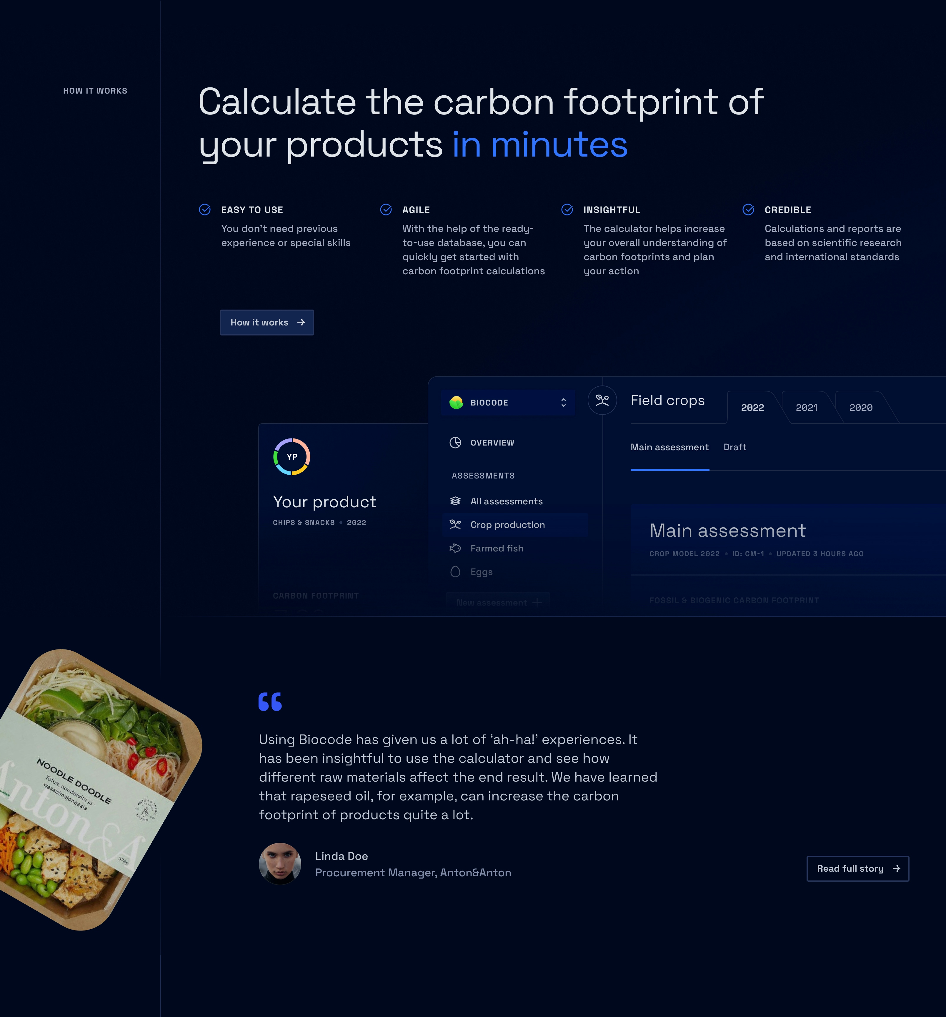
”Using Biocode has given us a lot of ‘ah-ha!’ experiences. It has been insightful to use the calculator and see how different raw materials affect the end result. We have learned that rapeseed oil, for example, can increase the carbon footprint of products quite a lot.
In-depth carbon footprint insights
The results section presents a detailed view of emissions, broken down by various life cycle stages, including cradle-to-gate and cradle-to-cradle. Illustrations distinguish between different LCA stages, making it easy to interpret the data. Users can also view their product's yearly progress analysis, use the comparison feature to track improvements, and explore emissions details by category or specific emissions.


